County Map Mode
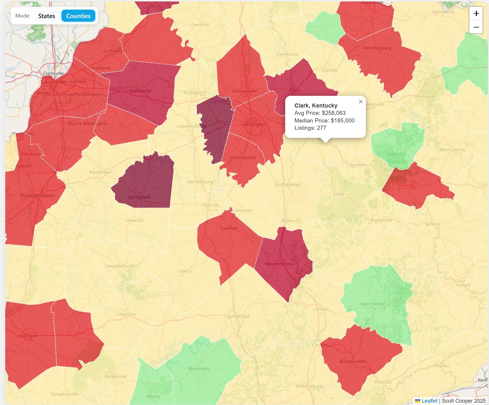
This section will focus on how I created the County Averages Map. The first major visualization for the project.
- Base Map
- After my planning stages the first thing I did was get the data sets that I would need to complete these maps.
- From there I set up a basic React component to render the map. Once I had the map set up I used GEO JSON data I mentioned in the previous article to create basic county and state overlay maps.
JSX: Base Map Rendering
<MapContainer>
  whenCreated={setMap}
  zoomControl={false}
  center={[39.5, -98.35]}
  zoom={4}
  style={mapStyle}
>
  <ZoomControl> position="topright" />
  <TileLayer>
    attribution="Scott Cooper 2025"
    url="https://{s}.tile.openstreetmap.org/{z}/{x}/{y}.png"
  />
  {mode === "county" && <CountyPriceComparison />}
  {mode === "state" && <StateBoundary />}
</MapContainer>
(example of how the map container looks)
The way this works depending on the mode that the user selects it will render the desired component. So if the county button is pressed the mode is set to "county" and the CountyPriceComparison is loaded.
Before looking at those two modes explicitly lets take a quick look at how I got the data ready to make useful maps. At this stage I just had counties for Kentucky rendering with no data.
Kentucky Counties Example:
useEffect(() => { fetch("/us_counties_5m.json") .then((res) => res.json()) .then((geo) => { setGeoData(geo); // JSON file is stored in the front end // Filter to Kentucky (FIPS code '21') return ( <GeoJSON> data={{ ...geoData, features: geoData.features.filter( (f) => f.properties.STATE === '21' ), }} style={style} onEachFeature={onEachFeature} /> ); }); }, []); - Setting up the data
- How the raw real estate records were cleaned and matched to Kentucky counties
- The initial data set from Kaggle wasn't as useful as it is has many incomplete entries.
- So the first step I took before anything was adding some additional rows for incomplete / complete listings, and tagging any reasons why the listing wasn't complete.
- For example if it was missing a bedroom number, or property size etc..
- From that point once I had everything labeled better I uploaded the data to Azure via Microsoft SQL Management Studio.
- API design
- For this map, I used an ASP.NET Core Web API built with MVC controllers and Entity Framework Core to query and group data stored in Azure SQL.
The controller endpoint aggregates raw real estate listings into average and median prices per city, returning the result as JSON for the frontend to consume. - On the frontend, the React component fetches two data sets. The first stored on the frontend is a U.S. county GeoJSON file.
And the second being the summarized data from the API. From there it merges them together before rendering: -
useEffect(() => { fetch("/us_counties_5m.json") .then((res) => res.json()) .then((geo) => { const _ = setGeoData(geo); // set county GeoJSON fetch("/api/BaseCountySummary/state/Kentucky") .then((res) => res.json()) .then((summaries) => { setCountySummaries(summaries); const matchMap = buildCountyMatchMap(geo, summaries); setCountyMatchMap(matchMap); }); }); }, []); - The backend BaseCountySummaryController handles grouping and averaging the data, while the frontend merges that summarized dataset with the county geometries to produce the colored map layer.
- For this map, I used an ASP.NET Core Web API built with MVC controllers and Entity Framework Core to query and group data stored in Azure SQL.
- Rendering on the map
- Using React and Leaflet to draw county boundaries and apply a color scale
- Managing tooltips, legends, and responsive map zoom levels
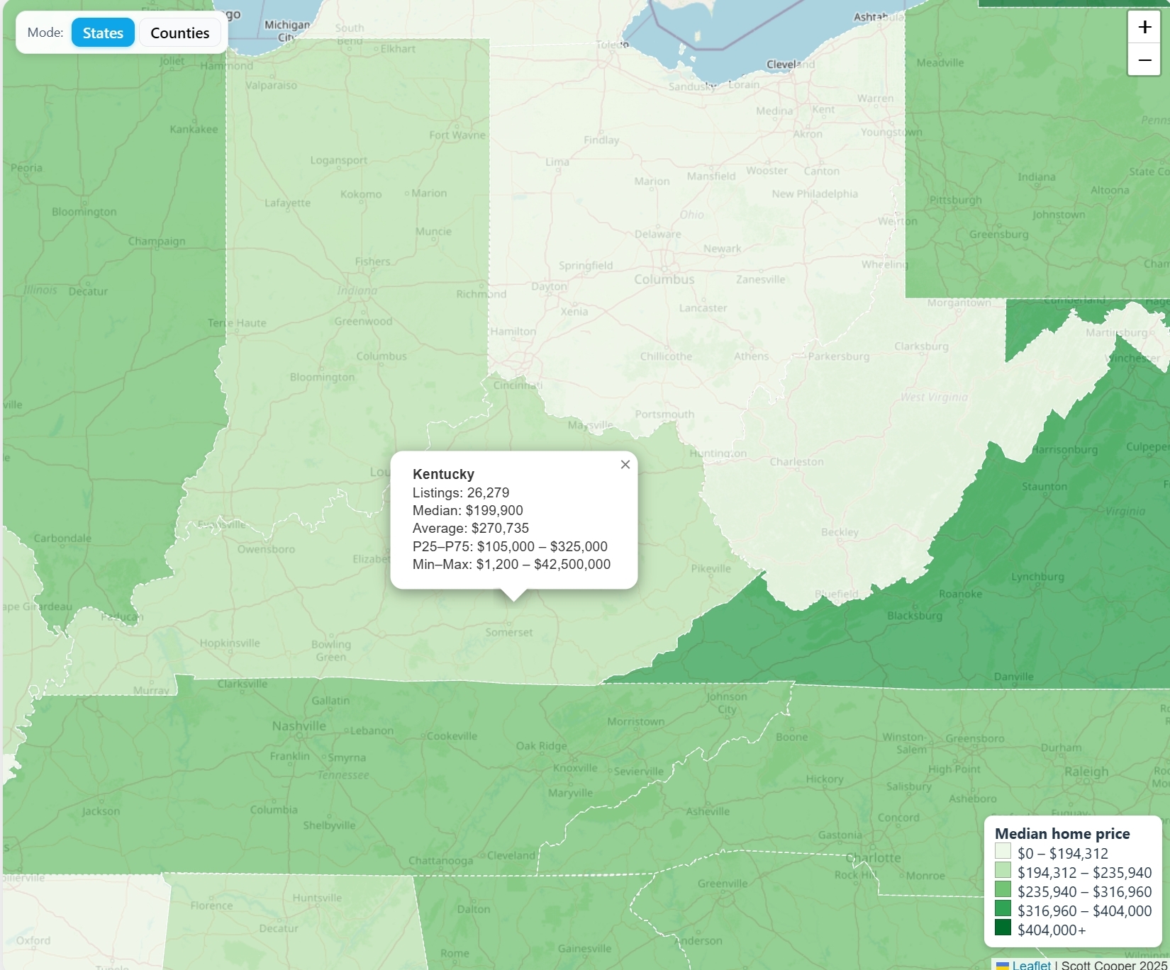
State Comparison Mode
The second visualization introduces a State Averages Map that compares housing data across all 50 states.
- Precomputing and storing state-level averages
- How data was grouped, normalized, and cached for display
- Trade-offs between real-time vs preprocessed analytics
- Mode switching
- Adding a “map mode” selector in React
- Fetching the right dataset and swapping between county and state views
- Design and usability
- Adjusting color scales for national comparisons
- Improving user clarity with legends, tooltips, and data value formatting
- Expanding beyond Kentucky
- Adding nationwide data while keeping performance consistent
- Plans for the future (maybe more detailed looks into specific regions)